+30 2104818012


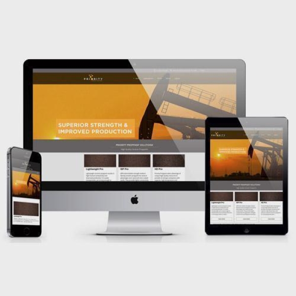
A responsive website is a single website that adapts to each device, whether desktop, laptop, smartphone or tablet.
A responsive website dynamically re-sizes its content and imagery for a variety of different screen sizes in order to ensure the website is effective and easy to use on any device.
Mobile web usage is growing extremely fast and this offers great opportunity. A website that is not optimized for mobile usage and performance leaves an enormous amount of potential customers out of reach.
Responsive web design makes websites beautiful across multiple devices, increasing conversion rates and overall traffic.
Our professional responsive web designs deliver outstanding results for both desktop and mobile users and make sure that your business is prepared for the future mobile web.